A practical guide to building interfaces that are more usable, more readable and sturdier
Before we start
Web accessibility is often described as an enormous topic, technical and full of acronyms. Partly it is: there are standards, criteria, assistive technologies, all sorts of use cases and real responsibilities.
But you do not need to know everything to start well. You need the right mental model and a handful of concrete habits you apply while writing HTML, CSS and JavaScript.
This guide does not replace the WCAG and it is not a certification. It is a practical foundation for avoiding the most common mistakes: divs used as buttons, invisible focus, forms with no labels, images with no useful description, text that is hard to read, painful mobile layouts and ARIA applied as a random patch.
The point is simple: an accessible page is not a “special” page. It is a page built better. It works better with a keyboard, a screen reader, zoom, mobile, slow connections, distraction, tiredness and real-world situations.
1. What web accessibility is
Web accessibility means designing and building content that can be perceived, understood and used by as many people as possible, including those who interact in ways you do not.
It is not only about people using a screen reader. It is also about people navigating with a keyboard, people with low vision, people who cannot easily tell certain colours apart, people using zoom, people with motor difficulties, people in a noisy environment, people browsing on a phone, or people who are simply tired and want to work out what to do straight away.
The important part is this: accessibility does not arrive at the end as an “extra check”. It belongs in the basic decisions:
- which HTML element do I choose?
- does the content have a clear hierarchy?
- can a button be used without a mouse?
- is a form error explained properly?
- does the text stay readable on mobile and under zoom?
- does an important image have a useful description?
When you get these decisions right you make life better for a lot of people, and you usually end up with cleaner code too.
A practical definition
An accessible page is a page that does not force the user into one single way of interacting.
If you can read, listen, magnify, navigate by keyboard, understand the errors, tell the controls apart and complete the main flow, you are already much closer to a respectful interface.
2. The four WCAG principles
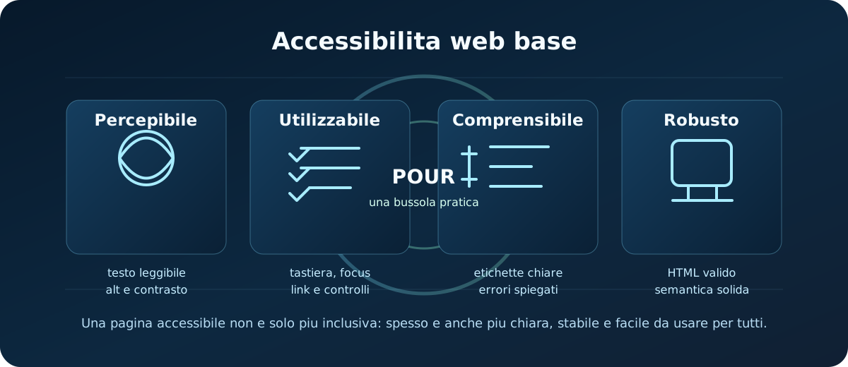
The WCAG are the most important international guidelines for the accessibility of web content. To get started, the most useful thing is not memorising every criterion, but understanding the four principles.
- Perceivable
- Information must be available in ways the user can perceive: readable text, alternatives for images, contrast, content that does not rely on colour alone.
- Operable
- The interface must be usable: keyboard, visible focus, reachable controls, no navigation traps.
- Understandable
- Content, labels, messages and errors must be clear and predictable.
- Robust
- The code must be solid enough to work with different browsers, assistive technologies and tools.
This compass is powerful: when you are unsure whether a choice is a good one, ask yourself which principle it is helping or hurting.
3. Semantic HTML: the first superpower
The simplest way to improve accessibility is to use the right HTML before inventing complicated solutions.
HTML is not just there to “show things”. It conveys meaning: a button is an action, a link takes you elsewhere, a heading organises content, a label describes an input, a nav groups navigation links.
<header>
  <nav aria-label="Main navigation">
    <a href="/en/">Home</a>
    <a href="/en/tutorials/">Tutorials</a>
  </nav>
</header>

<main>
  <h1>Web accessibility basics</h1>
  <section>
    <h2>Semantic HTML</h2>
    <p>The section's main content.</p>
  </section>
</main>
This code is clearer for browsers, developers and assistive technologies than a long series of meaningless <div> elements.
Headings: not just sizes
Headings create the map of your content. Do not use them just to get a bigger font.
- use one main H1 for the page's topic;
- use H2 for the main blocks;
- use H3 for inner sub-sections;
- do not skip levels purely for looks;
- do not turn every emphasised sentence into a heading.
If the heading hierarchy reads well, the page becomes easier to scan too.
Useful landmarks
Elements like <header>, <main>, <nav>, <footer> and <aside> help people understand the regions of a page.
They are not there to decorate the markup: they are there to orient people. A page with a single <main>, clear navigation and tidy sections is already far sturdier.
4. Links, buttons and navigation
A very common mistake is treating links and buttons as if they were interchangeable. They are not.
Links and buttons compared
Link
Takes you to another page, section, file or URL.
<a href="/en/tutorials/">Go to the tutorials</a>Button
Performs an action in the page or in an interface.
<button type="button">Open menu</button>If you use a clickable <div> instead of a button, you lose native behaviour, focus, semantics and often keyboard support as well.
Link text
Link text should make sense out of context too. “Click here” says nothing.
<a href="/en/tutorials/technical-seo-basics/">Technical SEO basics</a><a href="/en/contact/">Contact Codedge</a>
<a href="/en/tutorials/technical-seo-basics/">read here</a><a href="/en/contact/">click</a>
A clear link helps people, screen readers and general understanding of where the path leads.
5. Keyboard and focus
A page should be usable without a mouse too. This is one of the simplest and most revealing checks there is.
Open the page, let go of the mouse, press Tab and try to use everything that matters: menus, links, buttons, forms, modals, interactive cards.
- the focus order follows the visual and logical path;
- every interactive control can receive focus;
- focus is visible;
EnterandSpacework where you would expect;- you never get trapped inside custom components;
- you can close menus or modals without a mouse.
Do not remove focus
This is one of the worst mistakes:
*:focus {
  outline: none;
}
If you remove the outline without replacing it with a visible state, someone navigating by keyboard no longer knows where they are.
Better to build a focus style that fits the design:
a:focus-visible,
button:focus-visible,
input:focus-visible {
  outline: 3px solid #7ddcff;
  outline-offset: 3px;
}
Tabindex: sparingly and deliberately
tabindex="0" can make an element focusable when you genuinely need it. tabindex="-1" can be useful for moving focus by script onto a container or a message.
Avoid tabindex="1", tabindex="2" and the like: they create artificial orders that are hard to maintain.
6. Images and alt text
The alt attribute is not a mandatory description to be filled in the same way every time. It is a text alternative for when an image carries information.
The useful question is: if this image does not load, what information does the user lose?
<img
  src="/images/percorsi-apprendimento/accessibilita-web-base/panoramica-accessibilita-web-base.svg"
  alt="Overview of the four principles of web accessibility: perceivable, operable, understandable and robust"
  width="1200"
  height="520">
Three common cases
- Informative image
- Write an alt that carries the essential meaning, not every decorative detail.
- Decorative image
- Use
alt="", so assistive technologies skip it. - Image as a link
- The alt must explain the destination or the action, not just describe the picture.
Mistakes to avoid
alt="image", because it communicates nothing;- keyword stuffing inside the alt;
- enormous alts that repeat all the nearby text;
- leaving images that are real content without an alt;
- describing decorative icons that add no information.
7. Colour, contrast and text
Colour helps, but it must not be the only way to understand something.
If an error is signalled with red alone, someone who cannot easily distinguish that colour may miss it. Add text, sensible icons, borders, messages and clear states.
- text and background must have sufficient contrast;
- links and buttons must be distinguishable;
- hover, focus, active and error states must be recognisable;
- never convey information with colour alone;
- text must stay readable on mobile and under zoom.
Practical readability
Readability is not only contrast. How tiring the text is to read matters too.
- keep lines from getting too long;
- keep enough spacing;
- avoid huge blocks with no subheadings;
- do not shrink the font too far in compact panels;
- do not rely on placeholders or light grey text for important information.
8. Forms and errors
Forms are one of the places where accessibility gets very concrete. If a user does not understand what to fill in, or does not understand the error, the flow breaks.
The bare minimum:
- every important input has a
<label>associated with it; - a placeholder and a label are not the same thing;
- errors are written clearly;
- the error message sits near the field;
- errors are never signalled by colour alone;
- submitting does not wipe data without warning.
<label for="email">Email</label>
<input
  id="email"
  name="email"
  type="email"
  autocomplete="email"
  aria-describedby="email-help email-error">
<p id="email-help">We will only use this address to reply.</p>
<p id="email-error">Enter a valid email address.</p>
Labels, placeholders and instructions
A placeholder disappears as soon as you start typing and often has lower contrast. Do not use it as the only label.
<label for="name">Name</label><input id="name" name="name" autocomplete="given-name">
<input placeholder="Name">as the only indication;- messages like
Errorwith no explanation; - required fields that are not clearly marked.
9. ARIA without the confusion
ARIA exists to add accessibility information when native HTML is not enough, especially in dynamic or custom components.
The most important rule is simple: if you can use a native HTML element whose semantics and behaviour are already correct, use that.
<button type="button">Open menu</button><nav aria-label="Main navigation">...</nav><label for="email">Email</label>
<div role="button">Open menu</div>with no button behaviour;<span onclick="...">Submit</span>in place of a button;- sprinkling ARIA roles around to “improve” elements that were already correct.
When ARIA genuinely helps
ARIA can be useful for:
- communicating open/closed state with
aria-expanded; - connecting descriptions with
aria-describedby; - labelling regions or navigations with
aria-label; - announcing dynamic updates with live regions;
- building complex widgets when no native element is sufficient.
But ARIA does not add keyboard interaction for you. If you turn a <div> into a button with role="button", you still have to handle focus, Enter, Space and the states yourself. Which is why a real <button> is usually the better answer.
10. Responsive, motion and content
Accessible responsive design
A responsive layout is not automatically accessible. It has to stay usable when the screen, the zoom, the orientation or the density of the content changes.
- text does not overlap;
- touch targets are comfortable;
- the mobile menu works with keyboard and focus;
- important content does not disappear;
- zooming does not break layout or navigation;
- the visual order and the DOM order stay consistent.
Motion and animation
Animation can improve the experience, but it must not make a page hard to use.
If you are using significant movement, consider prefers-reduced-motion:
@media (prefers-reduced-motion: reduce) {
  *,
  *::before,
  *::after {
    animation-duration: 0.01ms;
    animation-iteration-count: 1;
    scroll-behavior: auto;
  }
}
You do not need to strip out every micro-interaction. You need to avoid movement that is excessive, unavoidable or impossible to stop.
Clear content
Accessibility is writing too. An interface with vague copy, cryptic errors and ambiguous calls to action creates barriers.
- use headings that genuinely explain the section;
- write buttons with clear actions;
- explain what happens after a submission;
- avoid generic messages like “something went wrong” when you can be more helpful;
- keep labels, links and destinations consistent with each other.
11. Final checklist before deploying
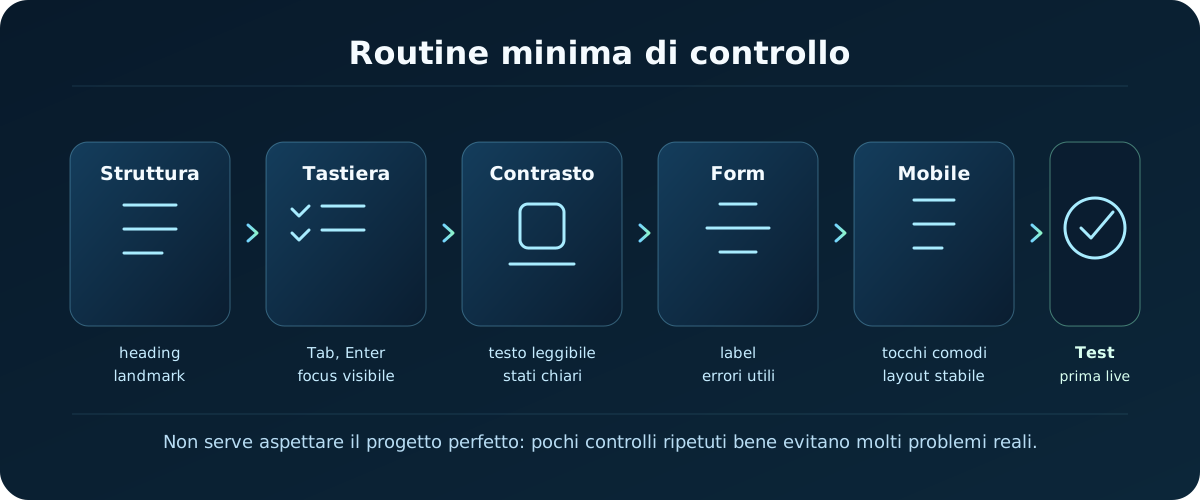
Quick check
- the page has a clear H1 and tidy headings;
- you use native HTML elements where they exist;
- links and buttons have consistent roles;
- navigating with
Tabworks; - focus is always visible;
- informative images have useful alts;
- decorative images have
alt=""; - text and controls have sufficient contrast;
- forms have labels, instructions and clear errors;
- the layout stays usable on mobile and under zoom;
- ARIA is used only where it is genuinely needed;
- the page can be completed without a mouse.
A five-minute manual test
- Open the page.
- Press
Taband follow the focus. - Open menus, links, buttons and forms without a mouse.
- Increase the browser zoom.
- Check mobile or a narrow viewport.
- Read the page looking only at headings, links and messages.
- Check that the form errors make sense.
This does not replace professional testing, screen readers, full audits or WCAG validation. But it catches a lot of problems before they go online.
Where to go from here
Once you understand this foundation, you start designing components that are less fragile. You are not just “doing accessibility”: you are choosing more correct HTML, more predictable interactions, clearer messages and sturdier pages.
To carry on, these guides connect well:
- Technical SEO basics: to connect accessibility, technical readability and the quality of the published page.
- Browsers and DevTools: to inspect the DOM, the applied CSS, the console and real behaviour.
- VS Code essentials: to work more tidily with files, problems and routines.
- Deployment basics: to publish and check the version that is genuinely online.
- All tutorials: to follow the other content available.
Useful sources when you want to go deeper: W3C WAI Accessibility Fundamentals, WCAG 2.2 Quick Reference, the W3C's WCAG overview and Using ARIA.
12. Quick reference (cheat sheet)
Here is a quick recap of the most important a11y attributes and roles to check:
| Element / Attribute | Typical syntax | What it is for |
|---|---|---|
| alt | <img alt="Description"> | Text description of an image, read aloud by screen readers. |
| :focus outline | outline: 2px solid #00A8FF; | The mandatory visual signal showing which element the keyboard has selected. |
| aria-hidden | aria-hidden="true" | Hides decorative elements (icons, for instance) from screen readers to avoid noisy announcements. |
| tabindex | tabindex="0" | Makes a normally non-interactive element (such as a div) reachable with Tab. |
13. Practical challenge: put yourself to the test
Audit and improve the accessibility of your own web pages:
Make a contact form and an image fully accessible to people navigating by keyboard only or using a screen reader.
Step-by-step instructions:- Make sure every image on your page has its
altattribute filled in. If the image is purely decorative, leave the attribute empty (alt=""). - Check your project's CSS and make sure the destructive rule
outline: none;is not there without an equivalent visible focus style to replace it. - Use only the
Tabkey to navigate the whole page, checking that you can reach every link and button and that the focus indicator is clearly visible. - Associate every label in the form with its input using the
forandidattributes.
14. Check what you have learned (quiz)
Test what you have learned in this guide with a quick 10-question multiple-choice quiz.