Style and layout for beginners
Before we start
If HTML is a house's load-bearing walls and the layout of its rooms, CSS is everything that makes it warm, distinctive and liveable: the finishes, the lighting, the colors and where the furniture goes. It is the language that turns a page of raw text into a memorable visual experience.
In this tutorial we won't bore ourselves listing hundreds of CSS properties to memorize. The goal is to build a solid mental model instead: to understand how the browser thinks and how it calculates the placement and painting of every pixel on screen. Once you master the pillars of CSS (from the cascade to the Box Model), you'll be able to translate any interface into code without resorting to trial and error.
Let's get the color palette ready and start drawing.

1. What CSS is and how it works
CSS stands for Cascading Style Sheets. Its sole purpose is to define the visual appearance of the elements defined in your HTML.
When the browser loads your site, it merges the structure (the DOM) with the style rules (the CSSOM) in a process called the **Render Tree**, painting the pixels onto the screen.
Anatomy of a CSS rule
CSS syntax is remarkably straightforward and has three main parts:
selettore {
  proprietà: valore;
  altra-proprietà: altro-valore;
}- Selector: tells the browser who to apply the style to (which tags or classes, for example).
- Property: the visual aspect you want to change (`color`, `font-size`, `margin`).
- Value: the specific setting you want to assign to the property (`red`, `16px`).
2. Linking CSS (and the art of the reset)
There are three ways to apply styles to HTML. Always remember that the golden rule of web design is the **separation of concerns**: HTML handles the content, CSS handles the style.
- External stylesheet (recommended): write the rules in a separate `.css` file (`style.css`, say) and link it in the HTML head with `<link rel="stylesheet" href="style.css">`. This is standard practice because it lets you use the same styles across several pages.
- Internal style tag: put the rules directly in the HTML head inside a `<style>` tag. Only useful for quick temporary tests.
- Inline styles: write the rules straight into the HTML tag through the `style` attribute (`<p style="color: red;">`). Avoid it: it mixes logic and presentation, which makes the code extremely hard to maintain.
Why browsers "lie", and why a reset helps
If you create an empty HTML page with no CSS, you'll notice the text already has a font, the headings are large, and there are white margins at the edges of the screen. That happens because **every browser applies default styles** (the User Agent Stylesheet), and they differ slightly between Chrome, Safari and Firefox.
To stop your site looking different depending on the browser, developers put a **CSS reset** first. The reset flattens those default differences, giving you a blank, predictable canvas to paint on. The most common reset concerns box-sizing:
/* Reset base universale */
*, *::before, *::after {
  margin: 0;
  padding: 0;
  box-sizing: border-box;
}
3. The fundamental selectors
Before you can style an element, you have to be able to find it. That's what selectors are for. Here are the basics:
- Type (or tag) selector: selects every element with that specific tag (`h2` colors all H2 headings).
- Class selector: selects elements carrying a specific HTML class. It starts with a dot (`.`) and is reusable on as many elements as you like (`.card`).
- ID selector: selects a single unique element, marked with a hash (`#`). Since an ID must be unique on the page, use it very sparingly for styling.
/* Selettore di tipo */
p { color: #333; }

/* Selettore di classe */
.testo-evidenziato { background-color: yellow; }

/* Selettore di ID */
#bottone-speciale { border-radius: 50px; }
You can combine selectors by separating them with a space to find child elements (the descendant selector: `.menu a` finds every link inside the `.menu` class), or by separating them with a comma to apply the same style to different selectors (`h1, h2` selects both headings).
4. The cascade and specificity
What happens if two different rules try to apply different colors to the same paragraph? Who wins? In CSS the answer is governed by two key concepts.
The cascade
The browser reads code from top to bottom. When selectors are equally important, the rule written last wins and overrides the earlier ones:
p { color: red; }
p { color: blue; } /* Vince questa perché è scritta per ultima! */
Specificity: the points system
When the selectors differ, the browser calculates an importance score to decide the winner. More precise, specific selectors beat generic ones. Think of specificity as a points system:
- HTML tag: worth **1 point** (lowest specificity).
- CSS class: worth **10 points** (medium specificity).
- HTML ID: worth **100 points** (high specificity).
- Inline style: worth **1000 points** (maximum specificity).
Look at this example:
/* 1 Elemento = 1 punto */
p { color: blue; }

/* 1 Classe = 10 punti. Vince questa! */
.paragrafo-rosso { color: red; }
Avoid using `!important` at the end of your rules. It forces the value above any specificity calculation, but it turns debugging and future changes into a nightmare. Keep it as a last resort.
5. Shipping parcels: the Box Model
As far as the browser is concerned, **every element on the page is a rectangular box**. That box is governed by the Box Model.
The postal shipping metaphor
To understand the Box Model, imagine you have to ship a fragile ceramic vase by post:
- Content: the vase itself. It corresponds to the space taken up by text or images.
- Padding: the bubble wrap around the vase inside the box. It creates white space *inside* the element, inheriting its background.
- Border: the thickness of the cardboard box itself.
- Margin: the safe distance you keep between this box and the other parcels in the delivery van. It spaces elements apart on the outside.

The sizing trap, and how border-box saves you
By default, if you set an element's width to `300px` and then add `20px` of padding on each side and a `2px` border, the element's final on-screen width will be **344px** (300 + 20 + 20 + 2 + 2). That makes building precise layouts incredibly frustrating.
To solve this, we always set the global rule `box-sizing: border-box`. It tells the browser to include padding and border *inside* the width you set. Set `300px` and the element stays exactly `300px` wide, shrinking the inner content space instead. It is a fundamental rule in every modern project.
6. Colors and typography
A large part of visual identity comes down to text formatting and color management.
Color formats
In CSS you can set colors in several formats:
- HEX (hexadecimal): the classic web format (`#00a8ff`).
- RGBA: defines the red, green and blue channels plus alpha for transparency (`rgba(0, 168, 255, 0.5)` creates a color that is 50% transparent).
- HSL / HSLA: based on hue (0-360°), saturation (%) and lightness (%). Very handy for creating lighter or darker variants of the same color on the fly.
Accessible typography: px vs rem
Avoid setting text size in pixels (`px`). Pixels are absolute units. If a user with impaired vision sets their browser's text size to "very large", text written in `px` stays small and unreadable.
Use the **`rem`** unit instead, which is relative to the browser's base size (`1rem = 16px` by default). Set text to `1.25rem` (the equivalent of 20px) and the size adapts automatically to the user's preferences, which is far better for accessibility.
7. Horizontal and vertical layouts: Flexbox
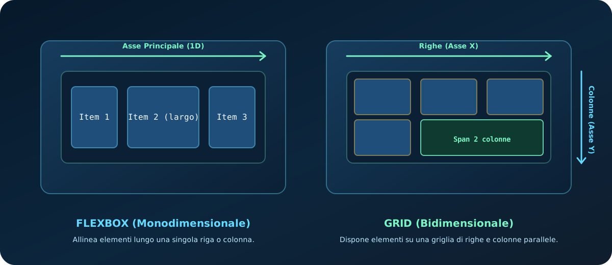
Flexbox is the go-to tool for aligning and distributing elements along **a single dimension** (horizontally as a row, or vertically as a column). It is perfect for navigation bars, lists of items, or alignment inside a component.
To switch it on, apply `display: flex` to the container element:
.menu {
  display: flex;
  justify-content: space-between; /* Distribuisce lo spazio tra gli elementi figli */
  align-items: center;            /* Centra gli elementi verticalmente */
  gap: 15px;                      /* Spazio minimo costante tra i figli */
}
With Flexbox you don't need to calculate complicated margins: the `justify-content` (main axis) and `align-items` (cross axis) properties handle the spacing automatically and elastically.
8. Two-dimensional layouts: Grid
While Flexbox works on one row or column at a time, CSS Grid lets you manage **two dimensions at once** (rows and columns). It is the ideal tool for card grids, complex photo galleries, or the structural frame of a page.
.griglia-card {
  display: grid;
  grid-template-columns: repeat(3, 1fr); /* 3 colonne di ugual dimensione */
  gap: 20px;                             /* Spazio tra righe e colonne */
}
The **`fr`** unit represents a fraction of the available space. In the example above, the three columns share the space in exactly equal parts. You can build remarkably responsive grids that adapt to the screen without using media queries:
grid-template-columns: repeat(auto-fit, minmax(280px, 1fr));9. Flexbox vs Grid: when to use which
Understanding the logical difference between these two tools is one of the most common sticking points. Here is a simple decision guide based on how you approach the build:
| Characteristic | Flexbox | CSS Grid |
|---|---|---|
| Dimension | One-dimensional (row *or* column) | Two-dimensional (rows *and* columns) |
| Approach | "Content-out" (the content defines the space) | "Layout-in" (the grid defines the space) |
| Ideal use | Navbars, icon alignment, side-by-side buttons | Page sections, card galleries, asymmetric layouts |
Rule of thumb: if you need to align a group of elements along a straight line, use **Flexbox**. If you need to lay elements out on a structured grid where you want to control both vertical and horizontal alignment, use **CSS Grid**.
10. Positioning (position)
By default, the browser lays elements out one after another following the document's natural flow. The `position` property lets you "defy gravity" and step outside that ordering.
- `static` (default): the element follows the page's standard flow.
- `relative`: the element can be shifted relative to its normal position. Widely used as a reference container for absolutely positioned elements.
- `absolute`: the element is taken out of the page flow (other elements behave as if it didn't exist) and is positioned relative to its nearest non-static ancestor.
- `fixed`: the element is positioned relative to the browser window. It stays in the same place even as you scroll (a support chat widget in the bottom right, for instance).
- `sticky`: a hybrid behaviour. The element behaves normally until it reaches a given scroll threshold (`top: 0`, say), after which it "sticks" to the screen.
/* Schema tipico: un badge posizionato sopra l'angolo di una card */
.card {
  position: relative; /* La card fa da ancora di riferimento */
}

.badge {
  position: absolute;
  top: -10px;
  right: -10px;       /* Posizionato a cavallo dell'angolo in alto a destra */
}
11. Responsive design and mobile-first
A modern website has to be comfortable to read on a smartwatch screen and on a 4K television alike. Responsive design is the set of techniques used to achieve that.
Media queries and breakpoints
Media queries let you apply CSS rules only when certain screen conditions are met (the so-called breakpoints):
/* Stile base (Mobile-First: valido per tutti gli schermi a partire dagli smartphone) */
.griglia {
  grid-template-columns: 1fr;
}

/* Stile applicato solo su schermi larghi almeno 768px (Tablet e Desktop) */
@media (min-width: 768px) {
  .griglia {
    grid-template-columns: repeat(3, 1fr);
  }
}
The **mobile-first** approach means designing the site starting from the small smartphone screen (writing the base rules outside any media query) and then progressively adding columns, details and styles for larger screens inside `@media (min-width: ...)` queries. It is the modern industry standard.
12. CSS variables
CSS variables (or custom properties) let you store recurring values — brand colors, fonts, spacing — in one place and reuse them anywhere in the stylesheet.
They are usually declared in the `:root` pseudo-class to make them globally available:
:root {
  --colore-primario: #00a8ff;
  --padding-base: 1.5rem;
}

.pulsante {
  background-color: var(--colore-primario);
  padding: var(--padding-base);
}
If the brand color changes in future, you only have to edit a single line inside `:root` and the change propagates instantly across hundreds of stylesheet rules.
13. Transitions and animations: movement that impresses
Adding small touches of movement makes an interface feel interactive and premium. In modern CSS you can animate any element easily.
Transitions
A transition smooths the shift from one style to another when the state changes — when the user hovers over an element with `:hover`, for instance:
.bottone {
  background-color: #00a8ff;
  transition: background-color 0.3s ease-in-out; /* Transizione morbida */
}

.bottone:hover {
  background-color: #007cc0;
}
Transforms
The `transform` property lets you move, rotate or scale elements using the graphics card's hardware acceleration (the GPU), which delivers excellent performance and 60fps animation:
.card {
  transition: transform 0.3s cubic-bezier(0.25, 0.8, 0.25, 1);
}

.card:hover {
  transform: translateY(-5px) scale(1.03); /* Si solleva ed ingrandisce leggermente */
}
A note on taste: restraint is everything. The best animations last between `0.2s` and `0.4s` (micro-interactions). Continuous, slow or overly showy movement tires the reader out and slows older devices down.
14. Quick reference (cheat sheet)
Here is a recap of the most important alignment and sizing rules:
| Property | Common values | Main purpose |
|---|---|---|
| box-sizing | border-box | content-box | Absorbs padding and border inside the element's defined width. |
| display: flex | row | column | Enables Flexbox to align elements in a single direction (row or column). |
| justify-content | center | space-between | flex-start | Distributes the space between elements along the main axis. |
| align-items | center | stretch | flex-end | Aligns elements along the cross axis. |
| display: grid | grid-template-columns | Enables Grid to align elements on a two-dimensional grid. |
15. Practical challenge: put yourself to the test
Put the alignment and Box Model rules into practice in the playground:
Build a profile card with a blurred 'glassmorphism' effect and vertically aligned elements.
Step-by-step instructions:- Create a box with the class
.profile-card, settingmax-width: 350pxandpadding: 1.5rem. - Make sure the global
box-sizing: border-boxrule is active, so the padding doesn't increase the card's width. - Set a semi-transparent background and a thin border:
background: rgba(255, 255, 255, 0.06); border: 1px solid rgba(255, 255, 255, 0.15). - Enable Flexbox with
display: flex, turn the axis vertical withflex-direction: columnand centre the text withalign-items: center.
16. Where to go next
You learn CSS by getting your hands dirty: try to recreate layouts you see online and analyze how they are built. Here are the recommended next steps:
- Browser DevTools: the indispensable tool for debugging your Flexbox or Grid layouts, inspecting active rules in real time and working out which specificity is winning in the browser.
- JavaScript fundamentals: to start adding logic and advanced interactivity to your visuals.
- Web accessibility basics: to understand how to pick color combinations with the right contrast and keep keyboard focus visible for every user.
- All tutorials: back to the index to carry on with your learning path.
17. Check what you have learned (quiz)
Test what you have learned in this guide with a quick 10-question multiple-choice quiz.